SunBeam
SunBeam
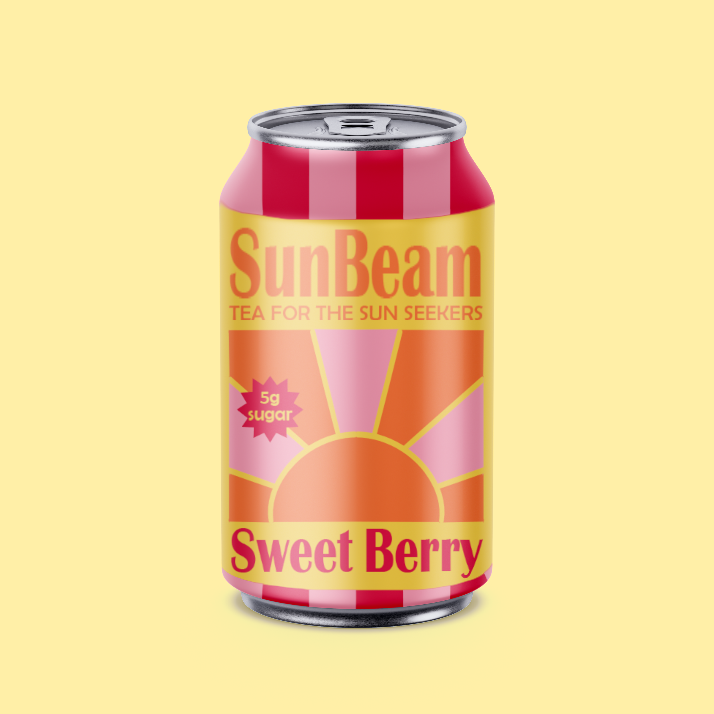
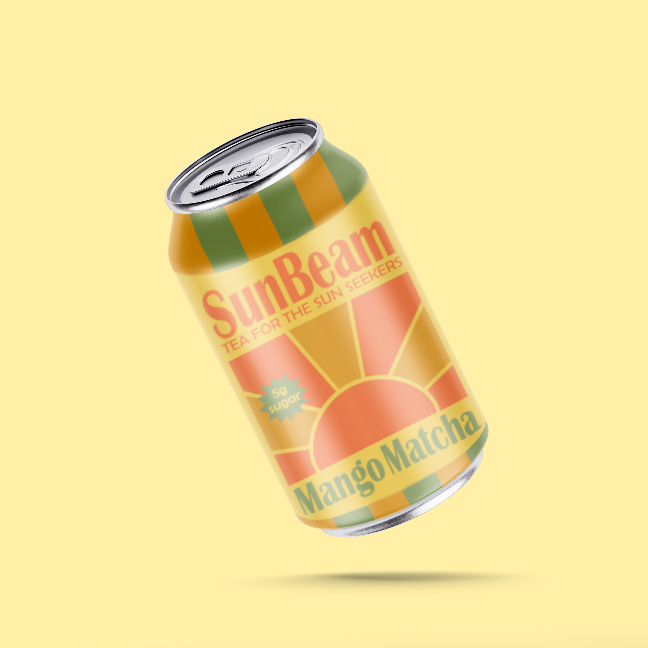
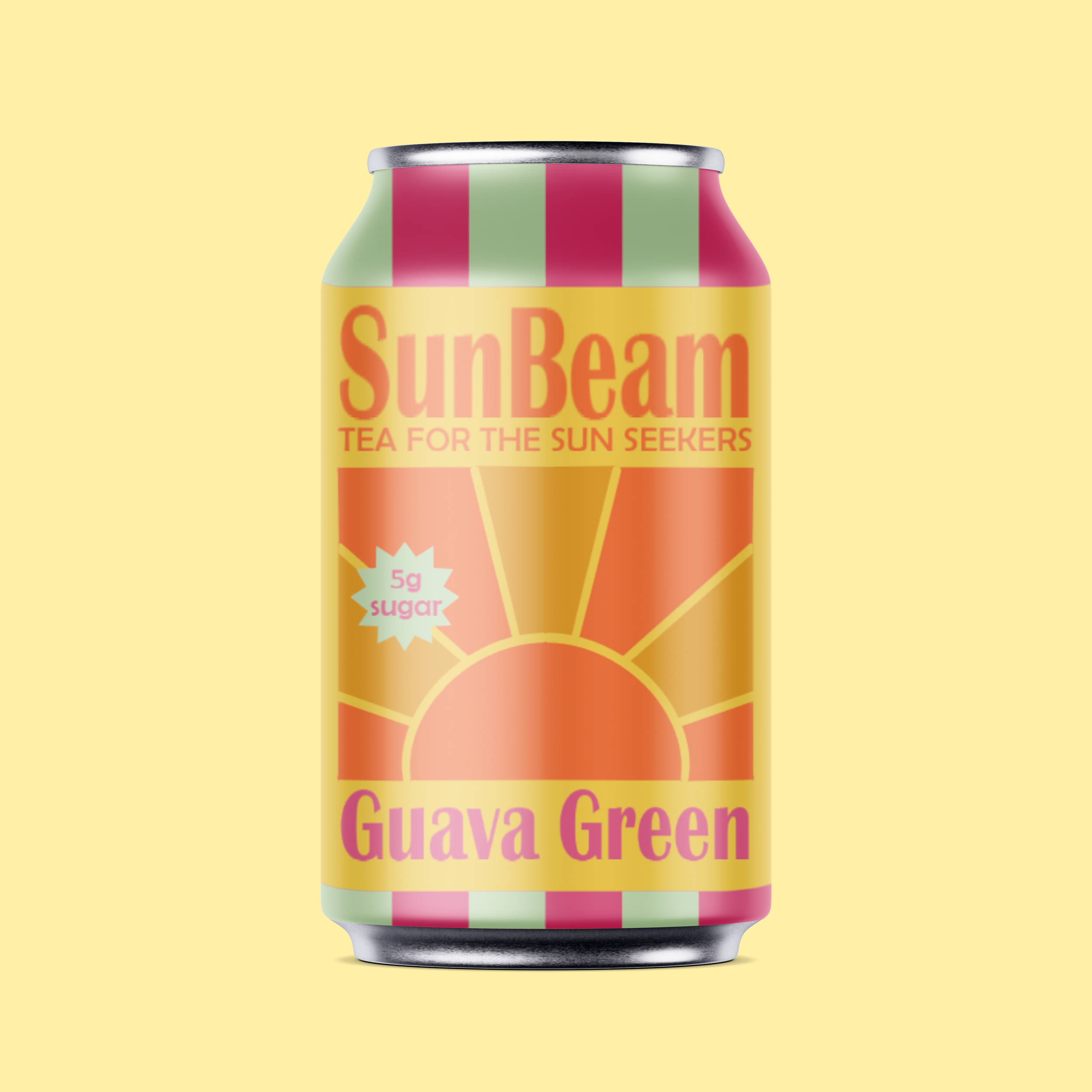
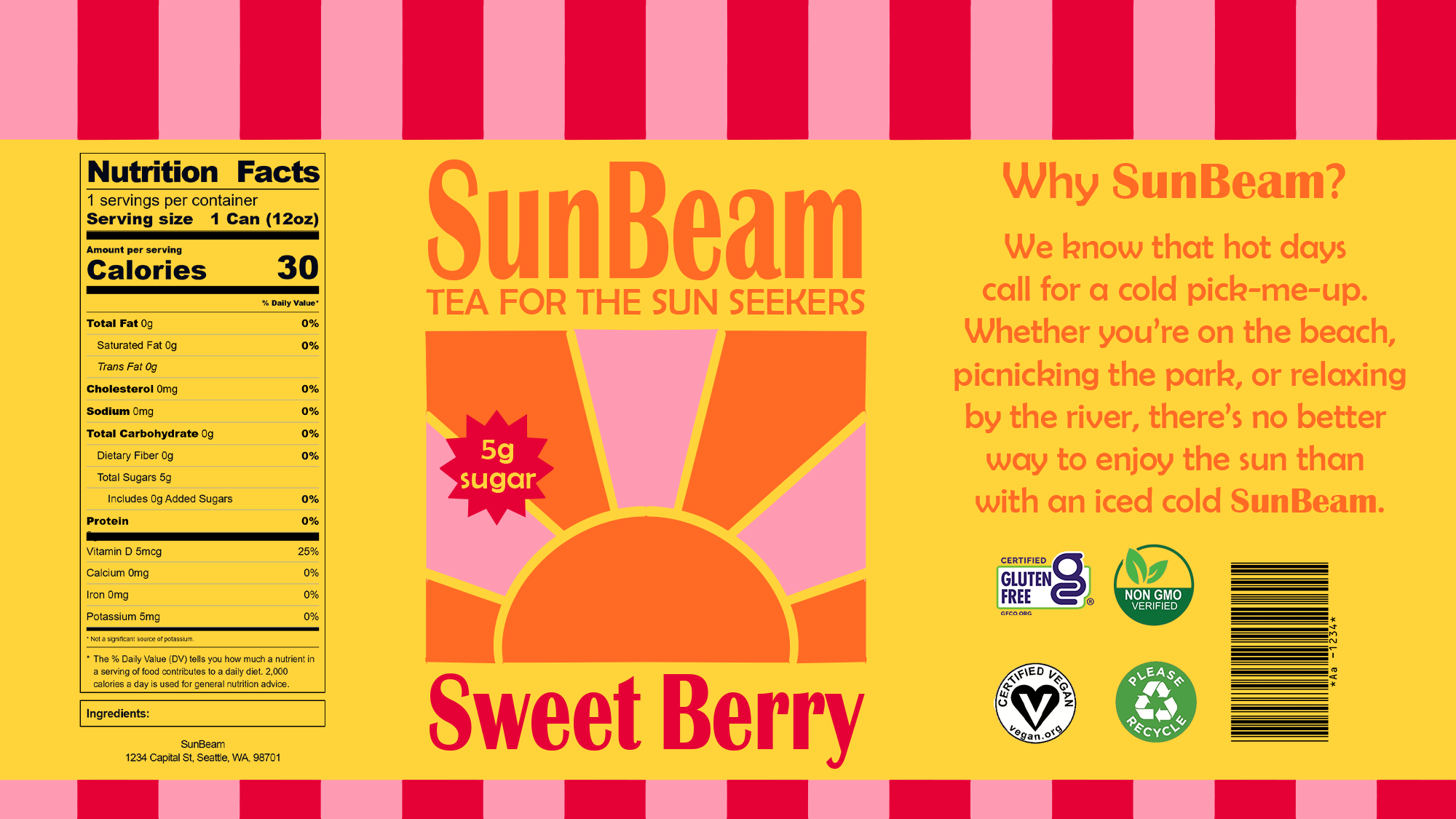
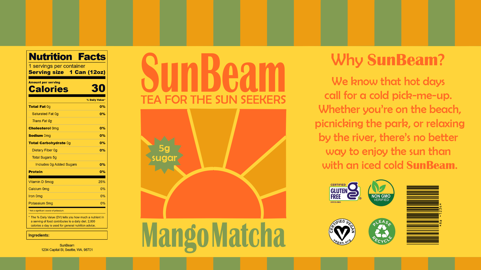
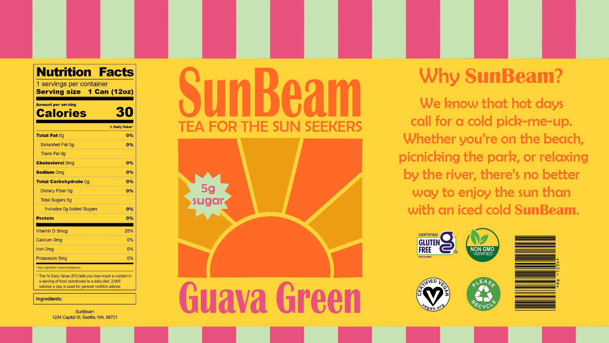
SunBeam is a conceptual iced tea brand offering a low‑sugar, refreshing pick‑me‑up designed for hot days. The identity emphasizes a playful, modern visual system crafted to stand out in the crowded tea and soda‑alternative market.
Targeting a young, active‑lifestyle audience, SunBeam pairs bright colors, retro patterns, and tropical flavors with low sugar and the natural benefits of tea to communicate easygoing fun and on‑the‑go refreshment between outdoor activities.
Role: Art Director, Designer, Strategist, Illustrator
Process
Iconography & Pattern: The SunBeam logo centers on a minimalistic sun motif to maintaining a clean, energetic compositions. A repeating pattern of colorful rectangles adds a playful appeal across applications without competing with product information.
Color: The visual foundation begins with consistent background and title font colors, establishing hierarchy across flavors. Individual flavor palettes complement that foundation to provide a clear contrast on the can labels.
Typography: Three sans-serif title candidates were evaluated for weight, spacing, and personality to match the brand’s easygoing tone. The chosen title typeface delivers a playful, retro character, while a more restrained sans‑serif supports body copy for optimal readability. This pairing creates a friendly voice without sacrificing clarity across packaging and collateral.
Mockups & Iteration: Compositions were repeatedly tested on 12-oz can 3‑D mockups to evaluate wrap, seam placement, and visual balance. Contextual viewing revealed necessary adjustments to scale, contrast, and alignment that flat comps did not expose. Iterative refinements continued until the design performed reliably in real-world viewing conditions.